Most Popular Free Quality Fonts
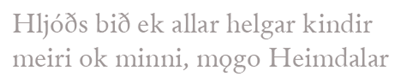
1. Andron Scriptor has been issued to support scholarly editing purposes for medieval philological studies and is provided free of charge. Font format: TrueType for Windows/Linux/Mac OS X.
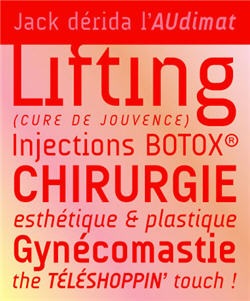
2. Audimat
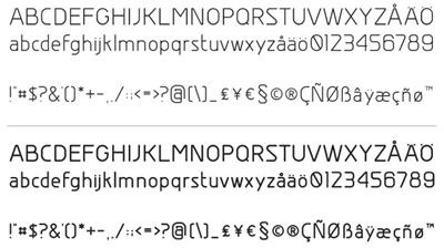
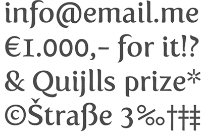
3. Chryſanþi Unicode font contains all unicode latin characters (including Basic Latin, Latin 1 Supplement, Latin Extended A & B, IPA, and Latin Extended Additional) as well as greek, cyrillic, hebrew, and ſeveral oþers.
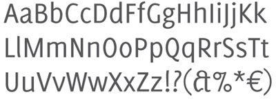
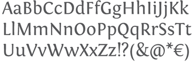
5. The Delicious. Its every character has a unique shape. Consistency in spacing, not in the character shape. Special attention was given to character spacing to obtain a homogenic appearance. With it’s relatively large x-height the Delicious can be used for text in smaller point sizes.
6. COM4t is an Original Free Font 2006. Designed by Hideki Katayama.
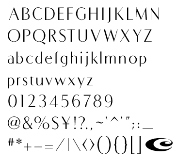
7. District Thin is the thinnest weight from GarageFonts’ District family, by Kienan and Dylan Smith.
8. Diavlo is a free font that contains 5 weights: Light, Book, SemiBold, Bold and Black. Diavlo is organic and a bit square and sharp. Great attention has been given to detail, spacing and kerning. Each weight contains more than 300 glyphs and over 1.300 kerning pairs.
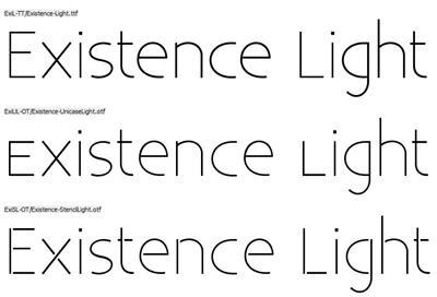
9. Existence
10. Fertigo is a bit like Laphroaic; the more you get to know it, the more you’ll (probably) appreciate it. With it’s auto-ligatures (no Open Type programs needed), a complete character set and many other unknown features it can be hard to resist.
11. The Fontin is designed to be used at small sizes. The color is darkish, the spacing loose and the x-height tall. The numbers of the Fontin have a ‘hybrid’ design. They carry the characteristics of medieval numbers, but their size is larger than the x-height.
12. Garogier is a typeface not unlike Garamond (hence the name). It will have optical size through its instructions (i.e. at low sizes, also when it is used on a high-resolution device such as a printer, the characters are changed slightly to increase readablity). This is supported by Windows 98 and up (this includes 2000 and XP).
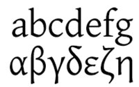
13. Gentium is a typeface family designed to enable the diverse ethnic groups around the world who use the Latin script to produce readable, high-quality publications. It supports a wide range of Latin-based alphabets and includes glyphs that correspond to all the Latin ranges of Unicode. The design is intended to be highly readable, reasonably compact, and visually attractive. The additional ‘extended’ Latin letters are designed to naturally harmonize with the traditional 26 ones. Diacritics are treated with careful thought and attention to their use. Gentium also supports both polytonic and monotonic Greek, including a number of alternate forms.
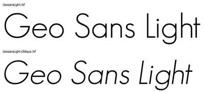
14. Geo Sans
15. Junicode (short for Junius-Unicode) is a Unicode font for medievalists. The current version is a beta. Junicode currently contains 2438 characters in the regular style (the italic, bold and bold italic styles are less complete). It implements these Unicode ranges completely (or nearly so): Basic Latin, Latin 1 Supplement, Latin Extended A, Latin Extended B, IPA Extensions, Spacing Modifier Letters, Greek, Greek Extended, Combining Diacritical Marks, Runic, and others.
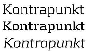
16. Kontrapunkt was awarded the Danish Design Prize for best typeface on October 22, 2004.
17. Legendum is a typeface not unlike MS’s Verdana. It has been made for optimal screen readability. It is anti-aliased on Windows as well. It now contains all normal Latin characters as well as all Greek characters, plus punctuation.

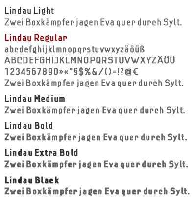
18. Lindau was inspired by a photocopy of an old pattern which dates back approximately to the 20s or 30s.
19. Linux Libertine is designed to give you an alternative for fonts like T*mes New Roman. It is free software published under terms of GPL. Contains kernig information, western ligatures, OpenType-Tables, small caps, etc.
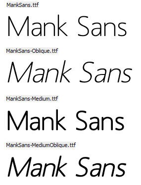
20. Mank Sans
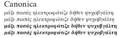
21. MgOpenCanonica is a serif typeface, based on the design of Times Roman.
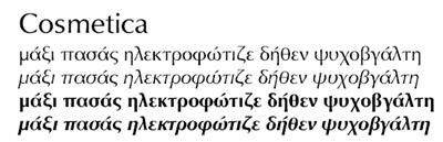
22. MgOpenCosmetica is a sans-serif typeface, based on the design of Optima.
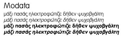
23. MgOpenModata is another sans-serif typeface.
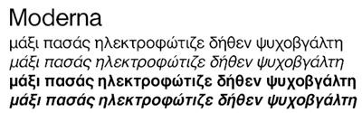
24. MgOpenModerna is a sans-serif typeface, based on the design of Helvetica.
25. Alejandro Paul’s Mobley was inspired by a 1960s jazz album which featured Neil Bold, a heavy display face with odd counters and cuts designed by Wayne Stettler. Expanding on Stettler’s ideas, Mobley constitutes a brand new typographic whole molded around the original.

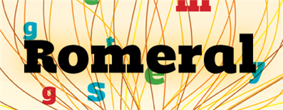
26. Romeral is designed to produce a noticeable visual impact that invites the audience to the reading due to its sizable thickness. The basic idea was to find a way to fill the color titles zone in order to create a comfortable atmosphere for the reading experience.
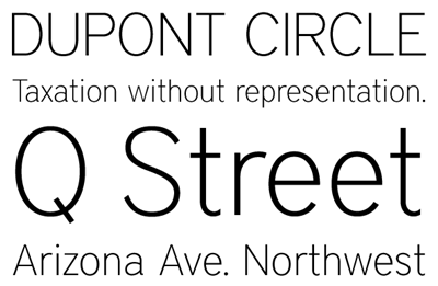
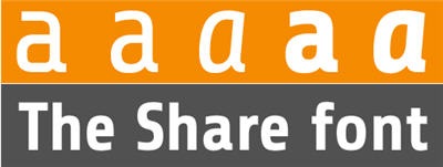
27. The special font-family, Share, has been developed to advance the TYPO3 identity further and to maintain consistency across communication channels. Share comes with the Western European code page.
28. Tallys is a font that is one degree slanted and has large caps, a small x-height and long ascenders. It comes (see also Fontin) with hybrid numbers and a complete character set. Besides standard ligatures some other combinations can be accessed via (application) OptenType options.
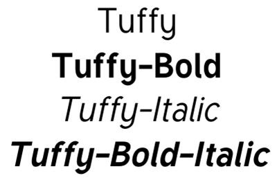
29. Tuffy by Thatcher Ulrich
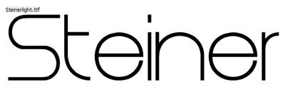
30. Steiner is ideal for logos and general design. It isn’t very suitable to be used with word-processors as it lacks some symbols and letters.
 Subscribe
Yes! Best I’ve seen so far.
Thanks for the share, amazing collection.
some great fonts there….. thank you for sharing.
Thank you, thank you, thank you. Most of these are beautiful. I have no idea why, but I love fonts.
Yes, these are really great fonts!
Great list, when there’s so many bad fonts out there to dig thru it’s great to have a list that cuts thru the chaff.
What do you mean by “free”? “Chryſanþi Unicode” (the first one I checked) explicitly says that commercial use must be approved by the author. That may be free for most uses, but you can’t just use it anywhere without worrying.
I’m interested in using the Linux Libertine fonts on Windows but the install directions are a little vague. Has anybody done this who can can contribute some installation tips here?
josh- that’s how it works. You need to give credit where credit is due.
Great fonts though, with some kerning “Fertigo” is going to be really fun to play with! ^-^*
I heard that 3 fonts were best for search engine optimization (SEO): Tahoma, New Times Roman & Arial. Is there any basis for this assumption? The moods created by the stylistic fonts above, like existence and Steiner are so elegant that I’d love to use them. On the other hand, sometimes when I’m publishing my site, a warning pops up and says that some browsers will not be able to read this font, do you want to proceed.
It doesn’t matter what font you use as far as SEO for search engines is concerned.. so long as you have all of the pure text in your html there will be no difference.
also I should mention, as far as SEO for viewing by users – Arial, Times New Roman, Verdana and Tahoma are usually the best.
I really love delicious bold, it is a great font to use in magazines. And district, is also very elegant!
very nice fonts
The Google link to this site is for ‘How to install Linux Libertine fonts to Windows.
So, what does another list of nice fonts which includes Linux Libertine have to do with how to install it to windows ?